One Product Family, One Platform, One Store
I think it is a great idea, and a strategy shared by all technology companies that try to build up their ecosystems, which makes the products more constant, predicable, maintainable and manageable.
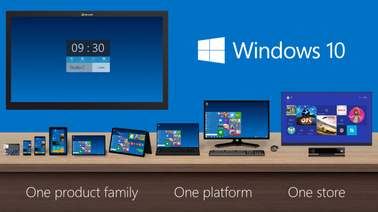
Windows Product Family
Launch Screen
The first thing I noticed is when Windows boots up, it no longer gives the desktop-unfriendly version of start screen but something everyone is familiar with, the desktop.
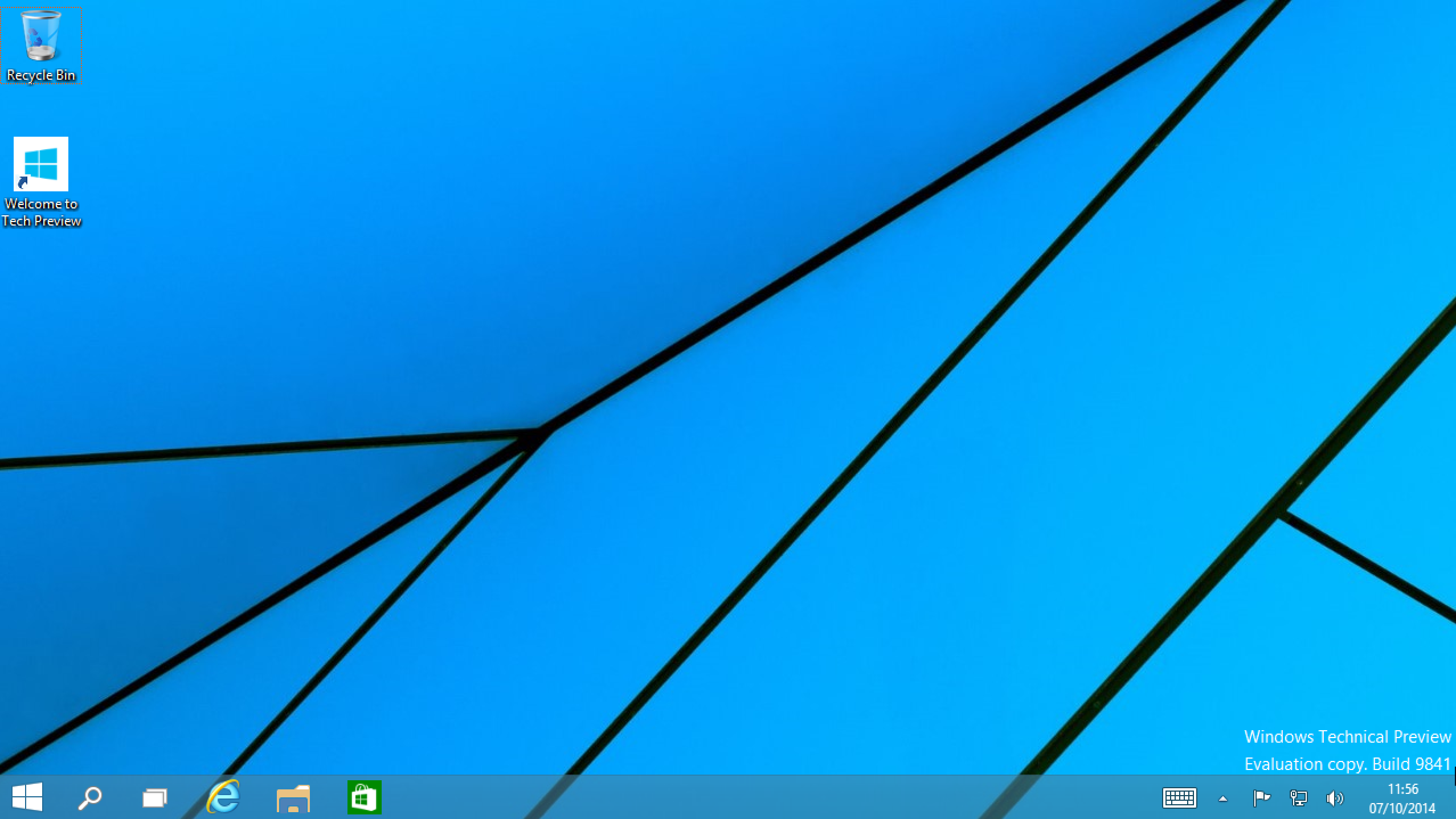
Windows Desktop is Back
And it comes with the long after start button (even though I am not bothered that much, because everything can be done via keyboard shortcuts), happy days!
Start Menu
Along side with start button, start menu has also made its glorious return. The effort in Windows 8 to make the start menu touch screen friendly has upset a lot of desktop users (again, I was completely fine with the change since I rather they focus more on ‘search bar’ which they did), so I am not surprise Microsoft now tries to make peace with them. Yet the menu does look like a hybrid of the one in Windows 7 with a flavour of Windows 8 tiles.
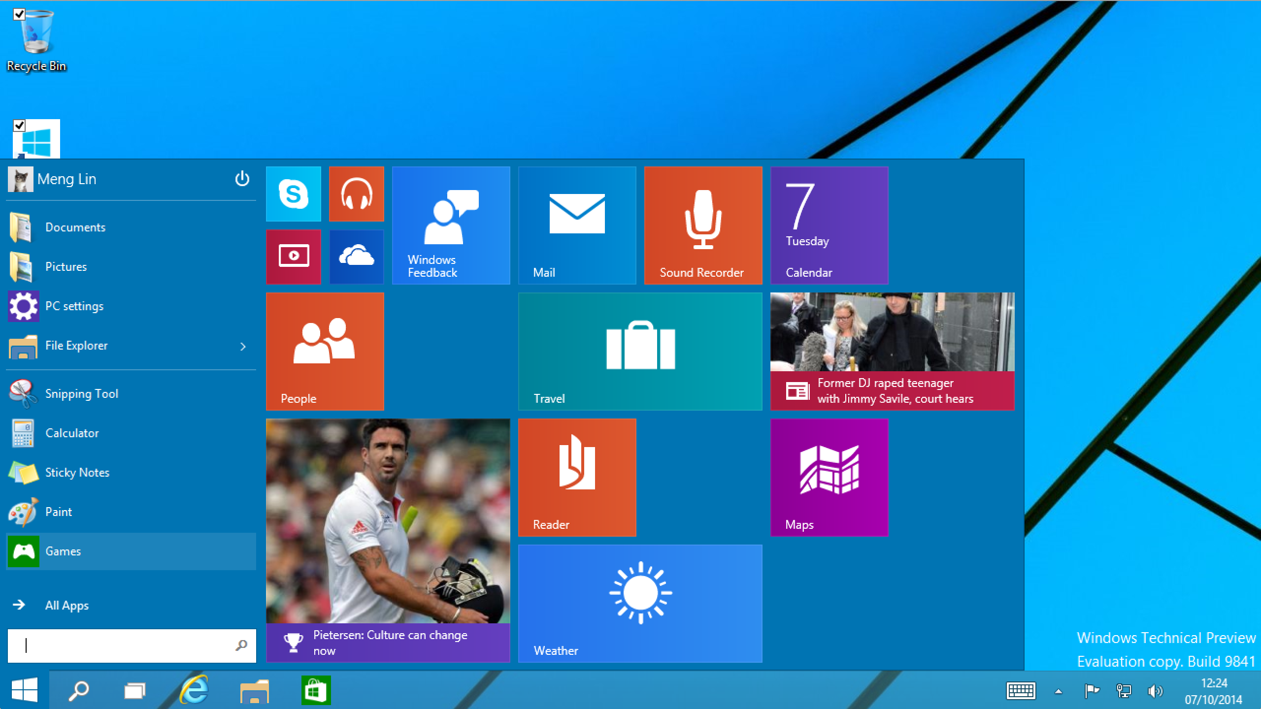
The Brand New Start Menu
The nice thing (may not be practical) is that users can also configure and rearrange the tiles part of start menu like it is in Windows 8. And for touch screen users or those who really like tiles, Windows also provides the option to use it as start screen.
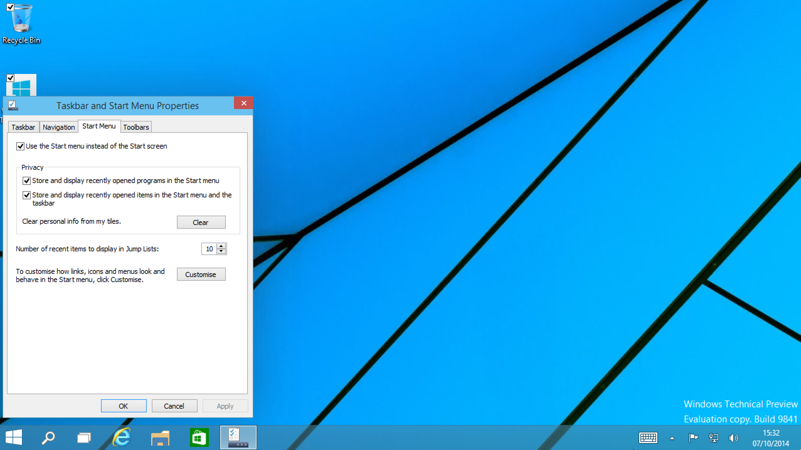
Choose to Use Windows 8 Style Start Screen
Unfortunately, the two tiles panel will not synchronise with each other, for obvious (there’s only limited space in Windows 7 style start menu) and perhaps technical reasons.
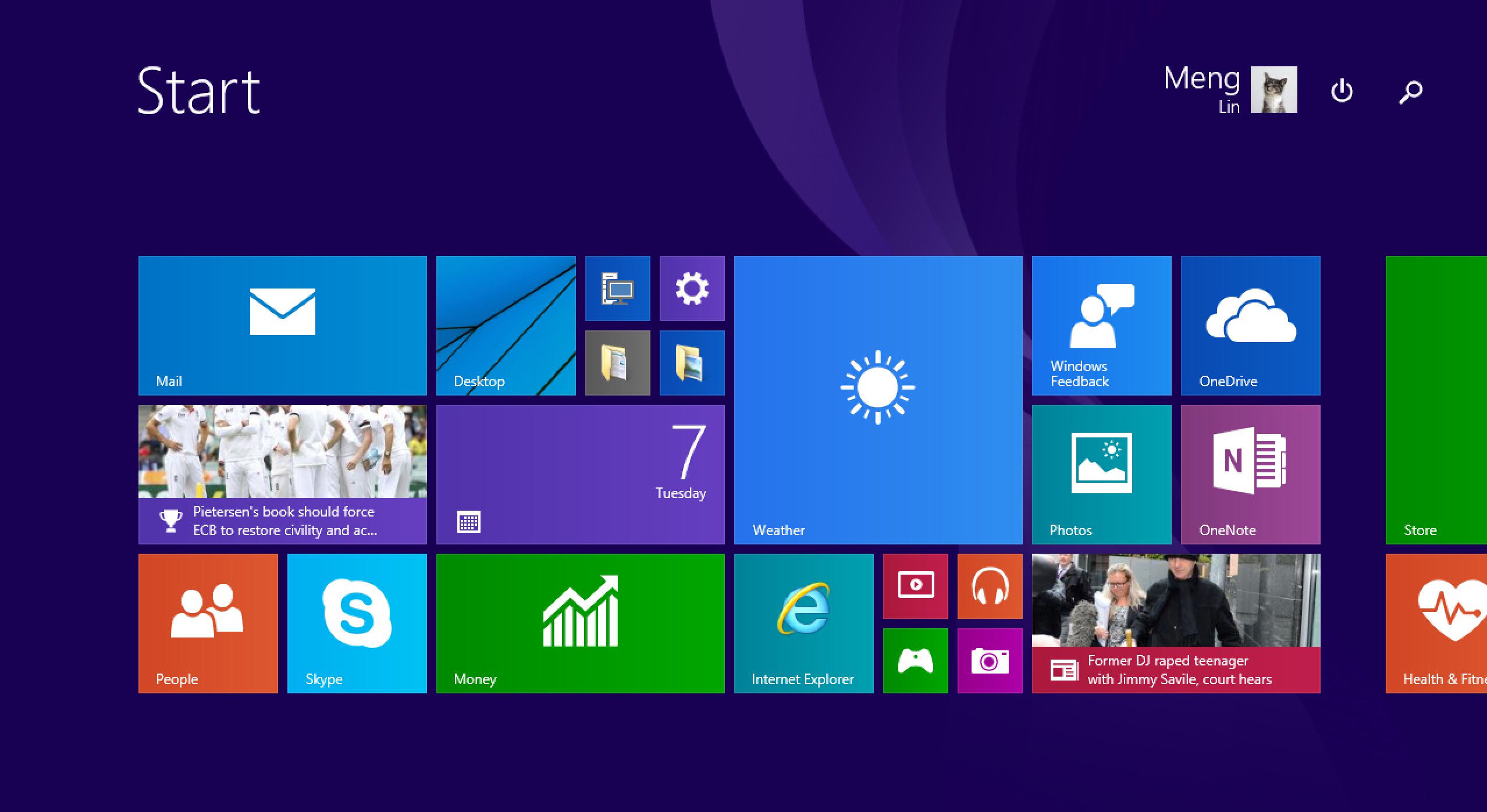
Windows 8 Style Start Screen
Search Bar
Much like spotlight, the ‘search’ in Windows has come from being an app kick-starter in Windows 7 to a full blown web browser, and file searcher to quickly get you started. It can be launched from both Taskbar and Start Menu, and of course how can I forget in a click of ‘Start’ button :)
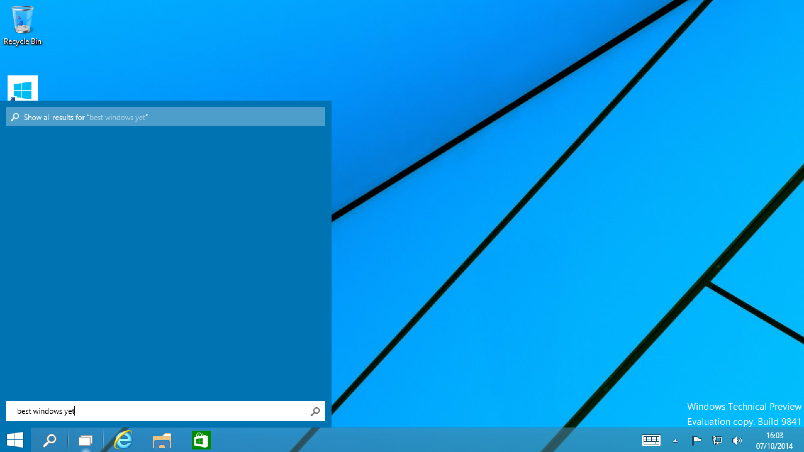
Search Bar
But Microsoft didn’t put in much thought about extending the feature rather than simply copying what the competitors (Mac, Ubuntu) have got. And I am still really skeptical on the file search function’s performance judging by the past experience.
Virtual Desktop
This is yet another feature existed for a while in Ubuntu and Mac, yet Windows recently tries to bring in, but only does it in a very modest way: it does what everyone does, nothing more.
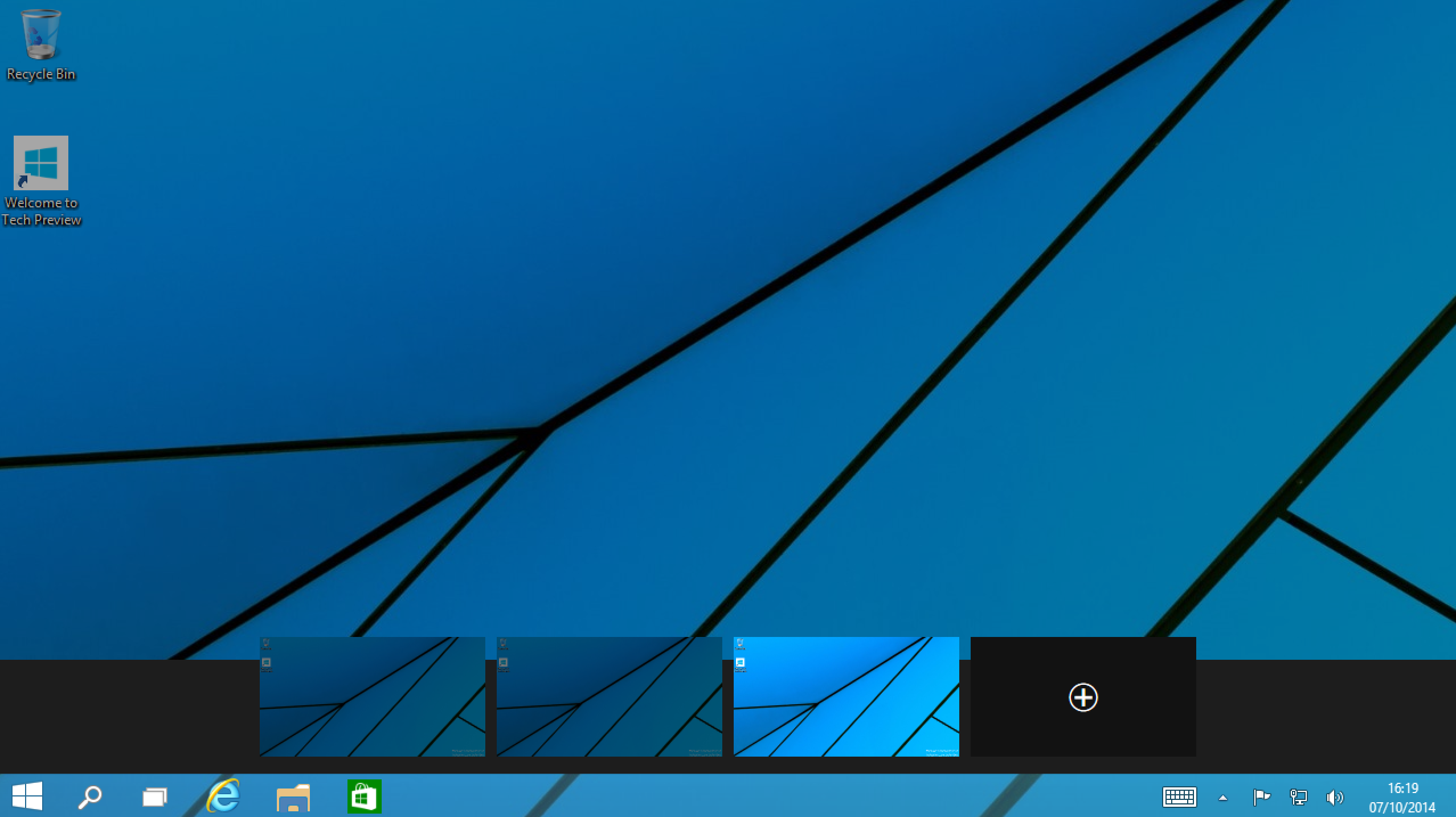
Virtual Desktop
Windows Apps
Now this is a strategic ground for Windows, as every single platform on the market nowadays has to have a developer community behind it so that it can thrive.
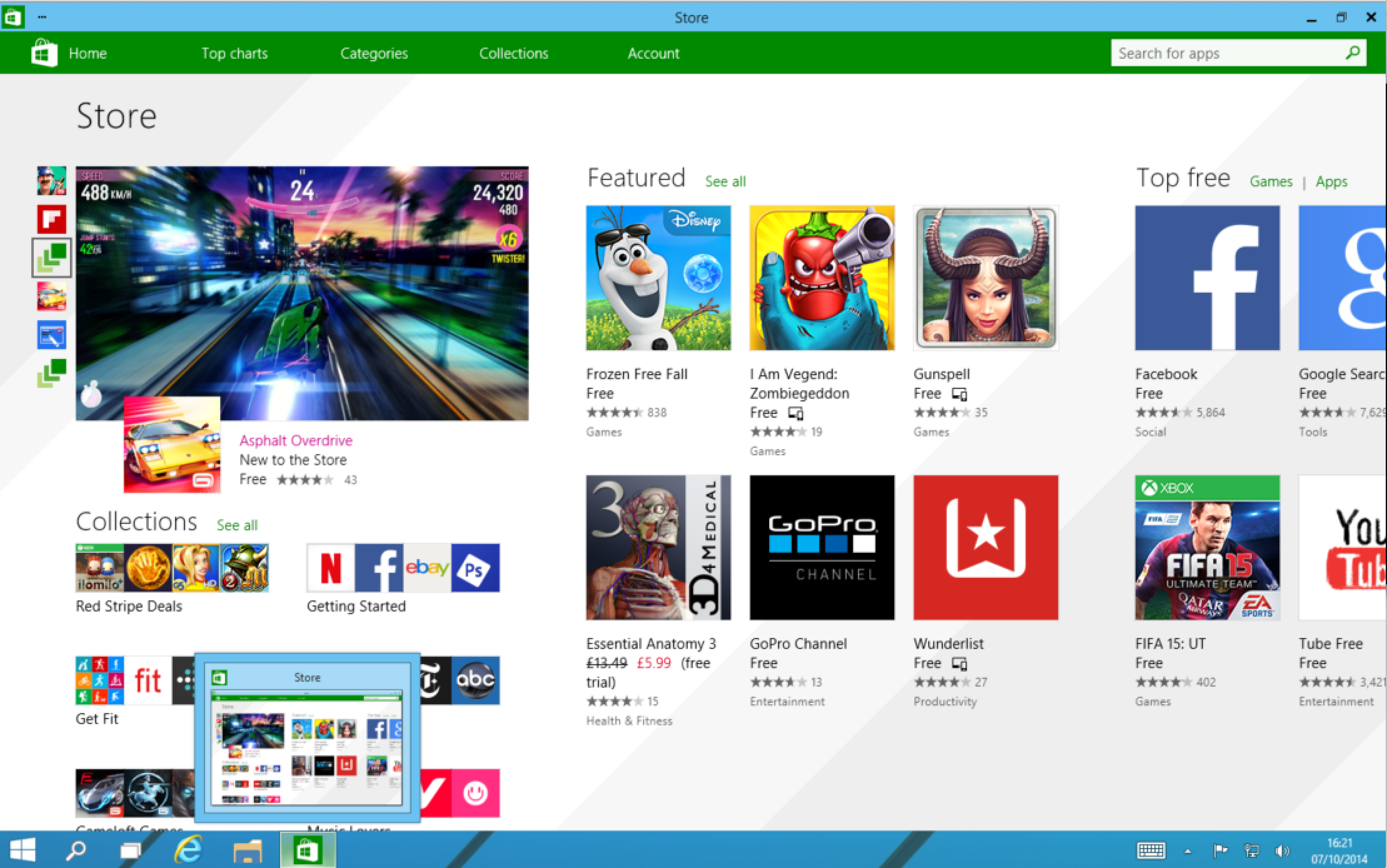
Windows Store
The unfortunate thing is, despite the productivity .NET gives, as once a .NET developer myself, I don’t even consider Windows Store a cool thing or has enough users reach for me to spend time on. How appeal is it to other developers?
But something does worth mentioning is the Windows Apps are built to such a fashion that it resizes like it is native to any platform, a build it once and work everywhere concept is surely going to make some Android and iOS developers complain about their own platforms, if not enough to win their hearts.
Personal Preference Integration
The only thing that really puzzles me is the old control panel still lives on at the age of modern Windows. I do like the traditional control panel, and it would make me sad if it goes away. But it just hasn’t been modernised to reflect the effort Microsoft put in renewing the UI.
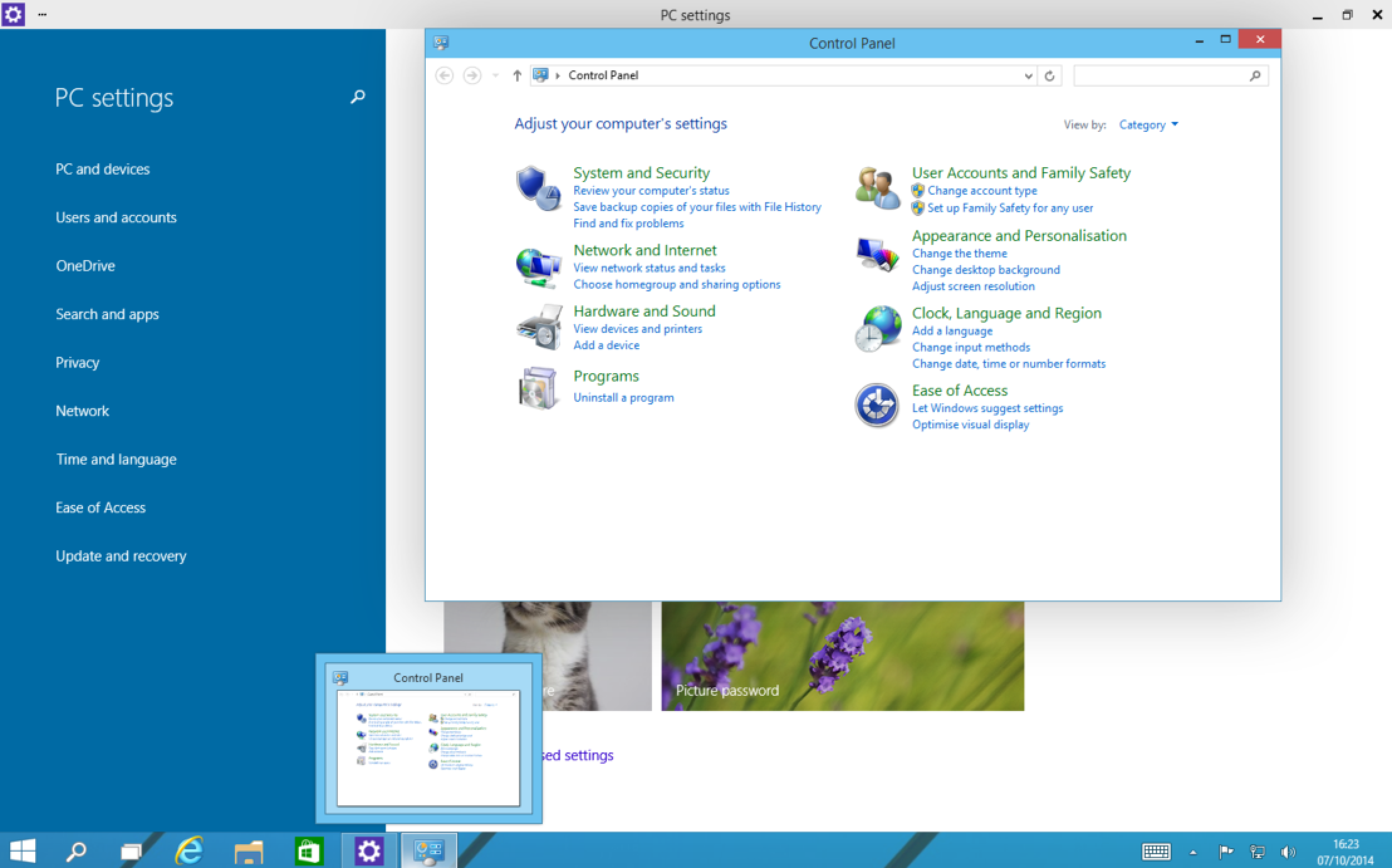
Control Panel Sitting Right Next to PC Settings
Command Prompt
This is the single most important thing that matters to me. I can certainly see the effort Microsoft made to empower its command line tools, by empowering it with PowerShell, chocolaty and now there are more hotkeys (with support for Ctrl+C and Ctrl+V, crazy isn’t it). But in all honesty, there is still no comparison to Bash.
Feedback
Yes, I was occasionally prompted with a dialog to give feedback. At least that’s a good sign that Microsoft is listening.
Conclusion
I think Windows 10 TP is Microsoft’s effort to mend the relationships with enterprise users for being radical in Windows 8.
It brings back the familiar side of Windows 7, yet still caters for tablets, mobile, Xbox and other platforms. And under the hood, they all benefit from the major surgeries happened during the radical move to make the OS faster and more stable.
I will not deny it is the best and most balanced Windows OS yet, while the lack of original thinking on how the OS could empower its users, I think this is only likely to be only a good fit for enterprise users with an OS upgrade due.